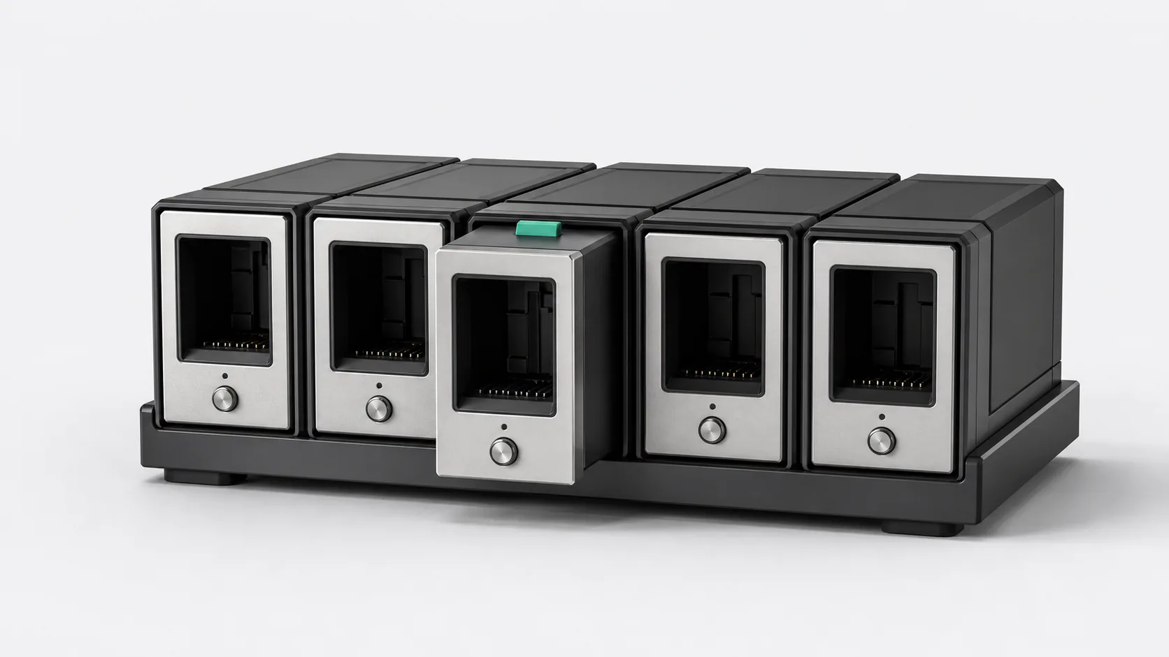
The dashboard becomes useful when every instrument shares the same visual grammar
The first ResoBox worked one market at a time. That was enough to prove the visual idea and too slow for comparison.
In January 2025, several markets moved onto one dashboard. The same range object repeated across a grid, with enough shared structure that differences between instruments became easier to notice.
The dashboard introduced a second challenge almost immediately: a grid of live components has to remember which choices belong to the market and which ones belong to the person.
Orientation before detail
The dashboard is a wide view. It helps someone scan the markets they chose, notice where movement is concentrated, and open a closer view with a reason.
That purpose gives the grid a limit. Every possible metric does not belong on every card. The cards need a common visual grammar and enough state to support comparison. Detail can wait for the next interaction.
Favorites narrowed the field. A range slider changed the amount of structure under inspection. Global controls made broad changes efficient, while per-market settings preserved an intentional exception. The dashboard became useful as those controls learned to coexist.
The bugs were about memory
One early color change altered the visible box count because presentation and range history had become tangled. Reordering the grid could disturb the live subscriptions behind the cards. A global update could erase a setting someone chose for one market.
None of these failures looked like a bad price. They felt like a product that forgot the user between updates.
Fixing them required a clearer distinction between live market state and interface state. The market should keep moving. A card’s position, local range choice, and visual preference should remain stable until the person changes them.
This principle later reached every live view. Continuity includes the market context and the user’s place inside it.
Opening a detailed market view should preserve that thread. The instrument and range context that caused the click already carry information about the user’s intent. Throwing them away would make the dashboard a launcher rather than a workspace. The transition should narrow the view without making the person reconstruct the question that led there.
Repetition earns the wide screen
Showing many instruments works because each card asks the eye to learn the same few objects. Direction uses the same cues. Range size means the same thing. An active marker has the same weight. Once the grammar is familiar, variation belongs to the market rather than the interface.
The dashboard does not rank trades or declare an opportunity. It gives chosen markets a comparable frame and lets attention move deliberately. The useful action may be opening one instrument. It may also be recognizing that nothing on the dashboard deserves a closer look.